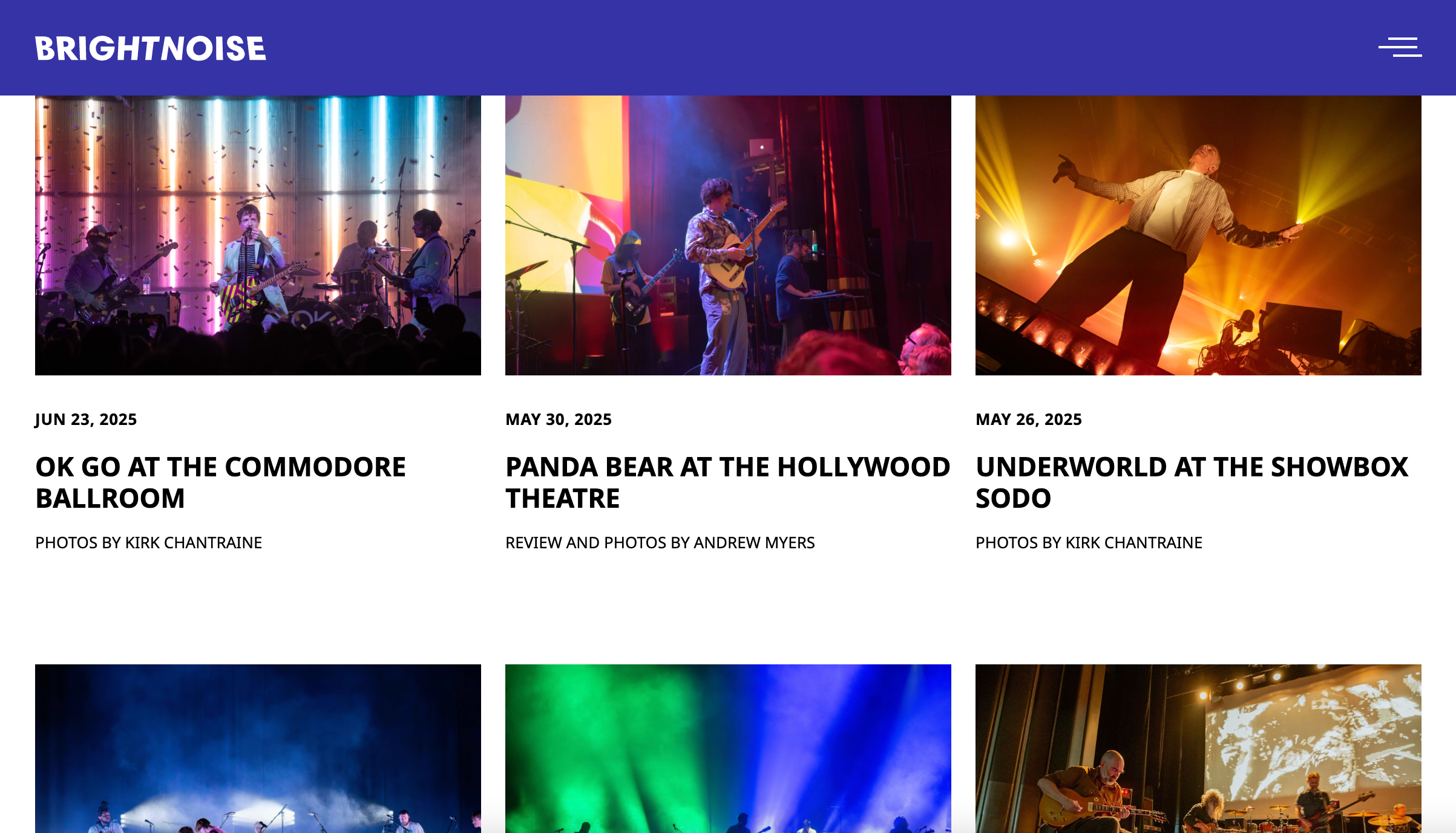
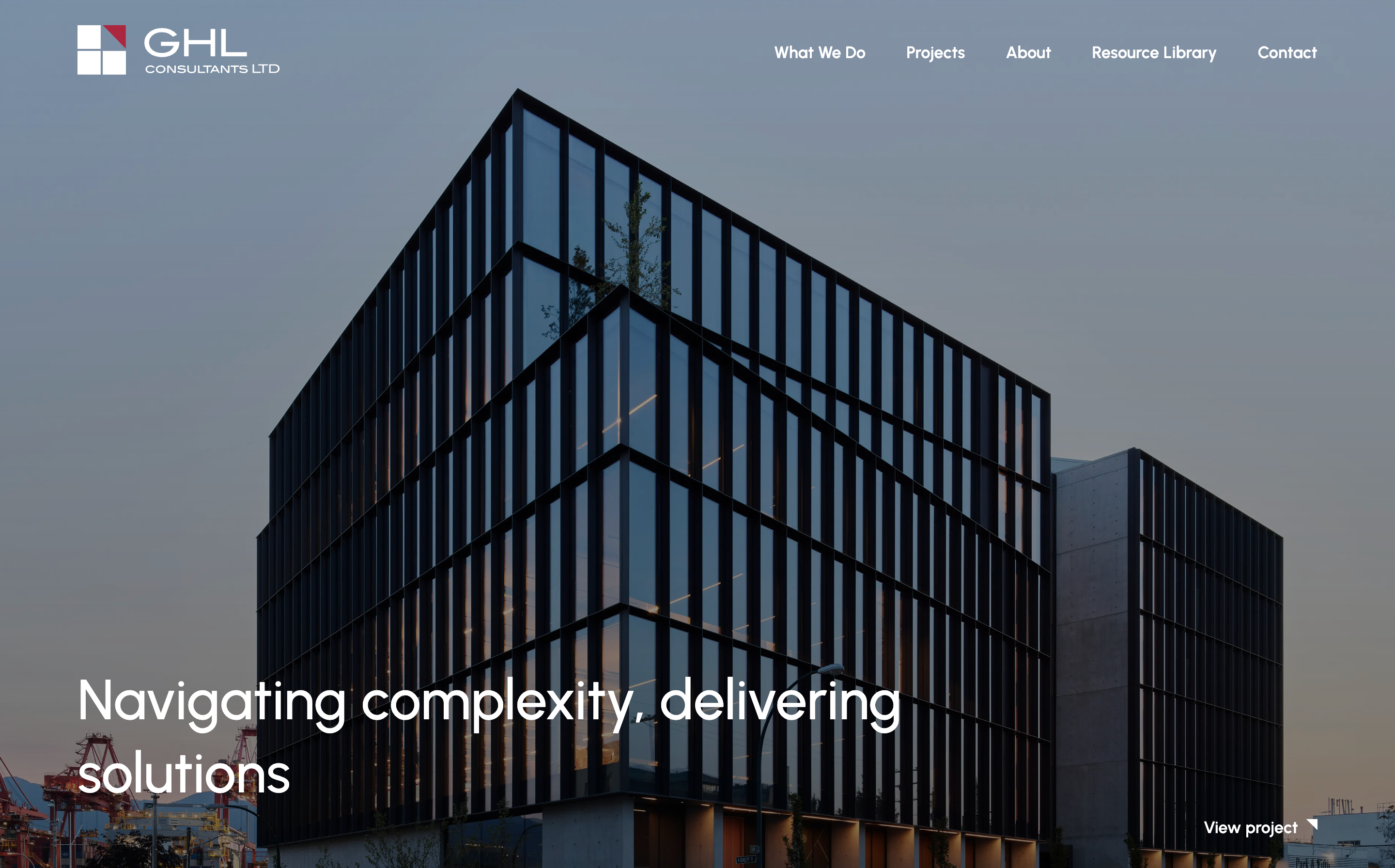
A clean, editorial-style layout features full-scale photography and a bold and vibrant brand identity
Client
Bright Noise
Services
Project Goals
-
Bold brand identity
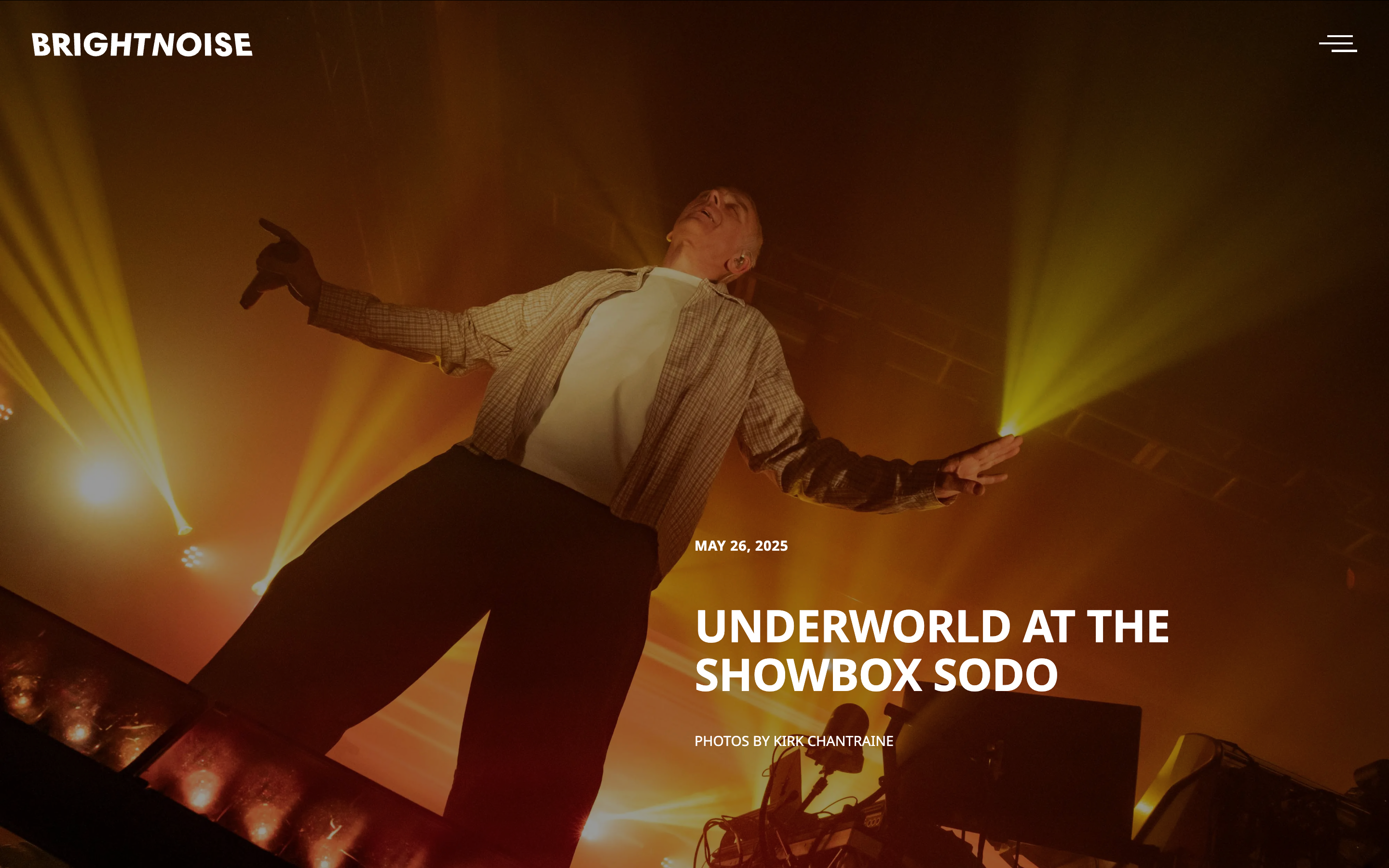
A bold brand identity that reflects the vibrancy of the images. -
Photography focus
Support display and storage of large, high-quality images. -
Multiple collaborators
Develop a user-friendly CMS that supports contributions from multiple users.
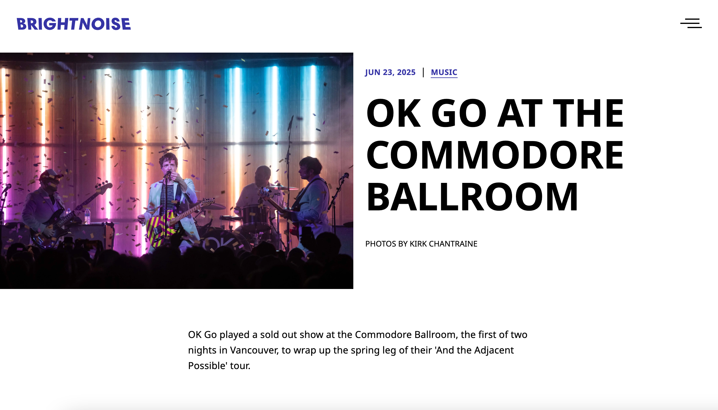
A bold brand identity is balanced by a simple, editorial style layout.
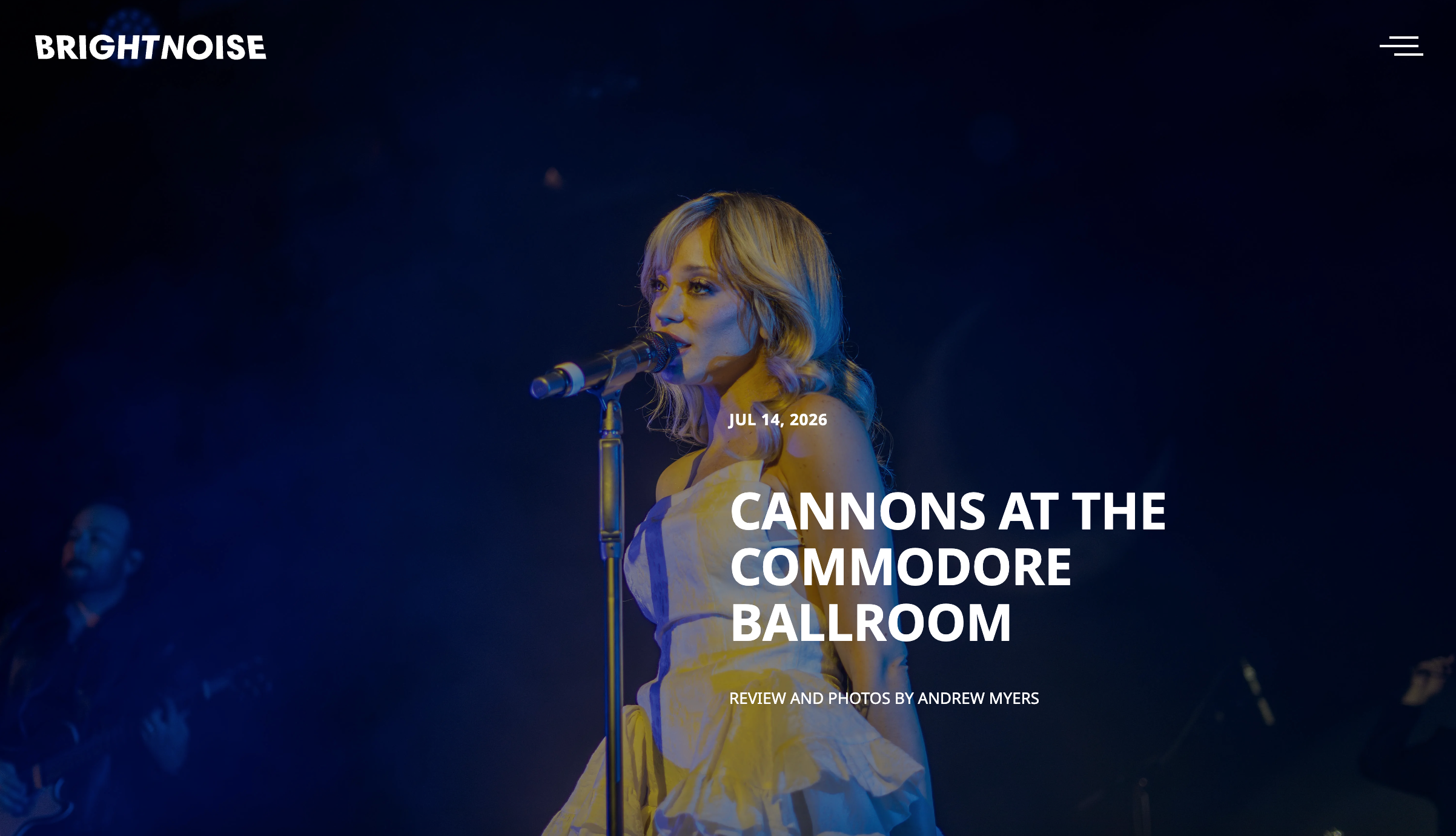
Photography is a prominent feature of the publication and the website features large, full-screen photos.

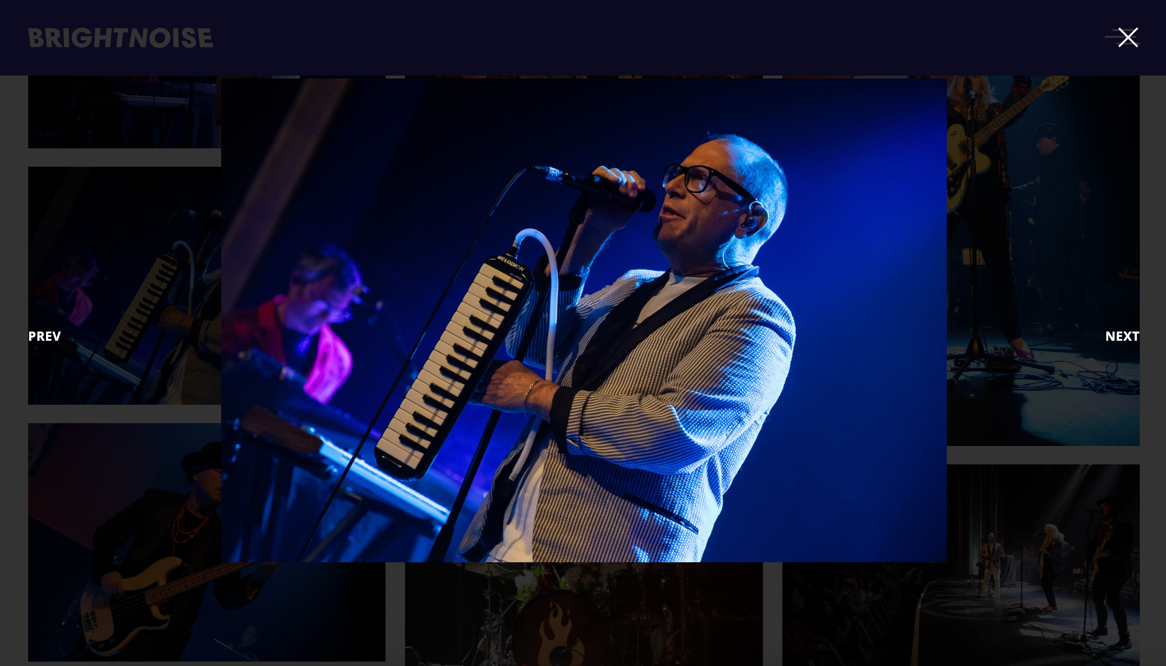
Articles feature a grid-style gallery and a viewing carousel.
Brand identity
Bright Noise is an online editorial-style website devoted to music and arts with a bold and vibrant brand identity.
The dynamic word mark features a slight distortion of shape—a visual representation of the elasticity of sound.
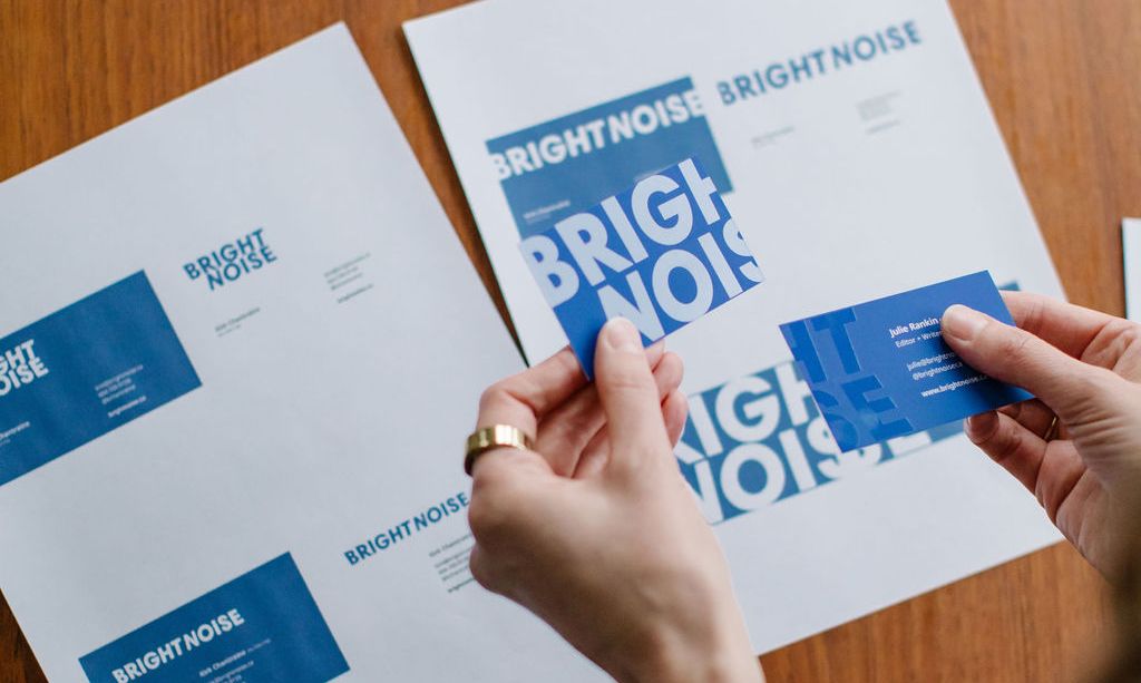
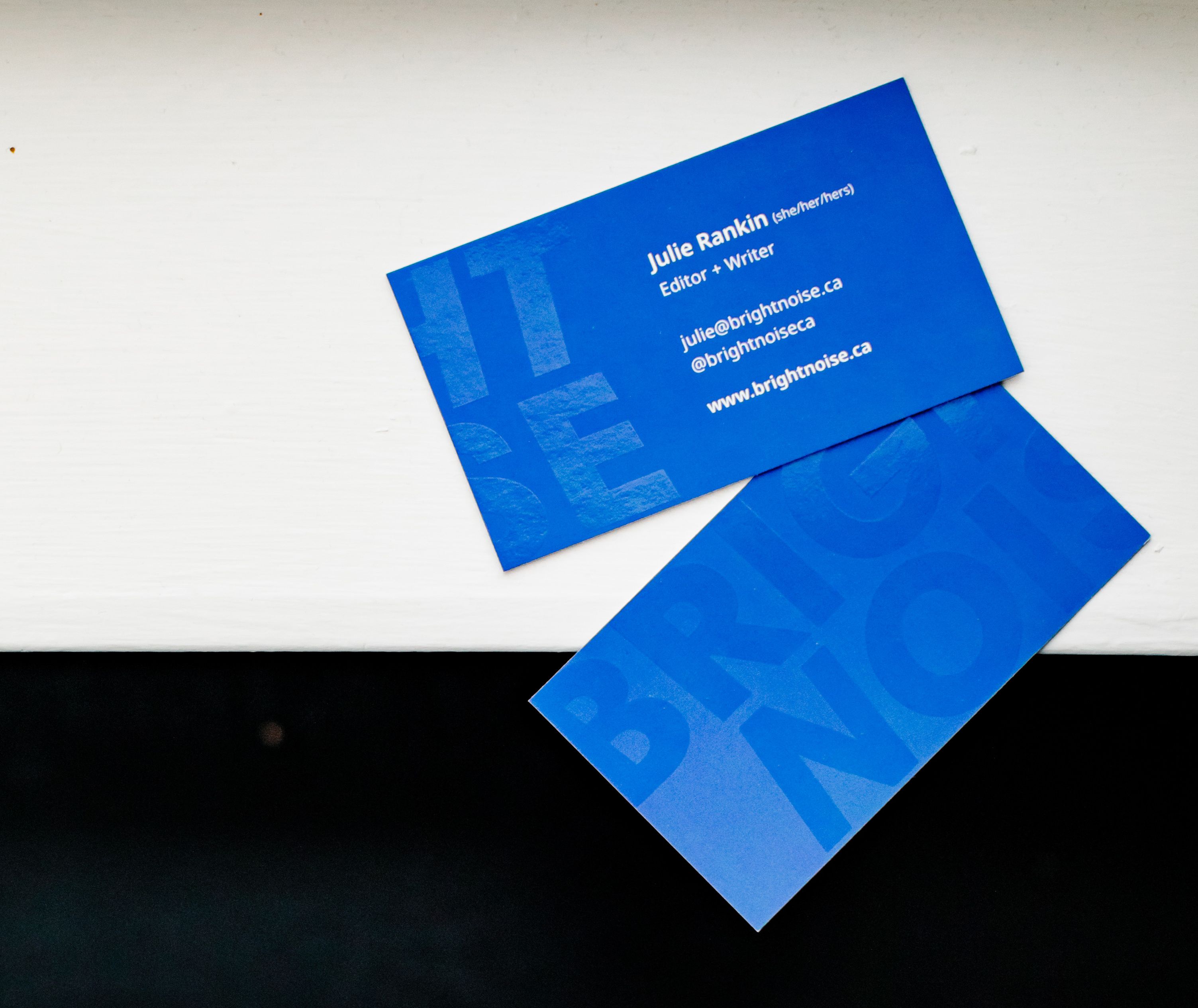
Business cards display the Bright Noise logo across the front and back in a spot gloss finish.
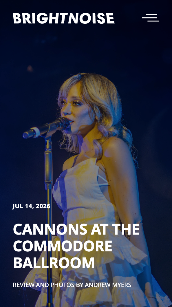
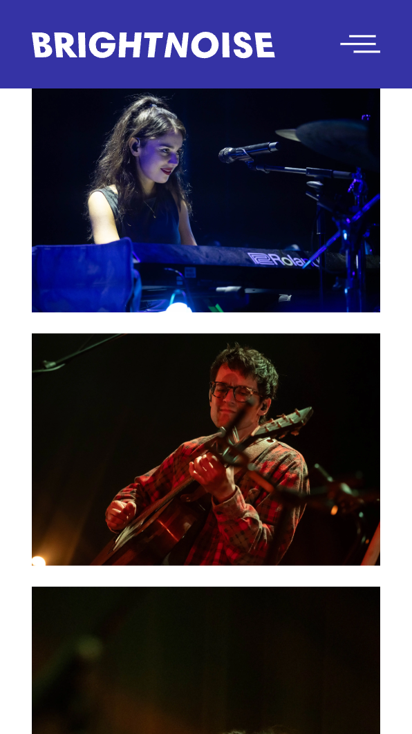
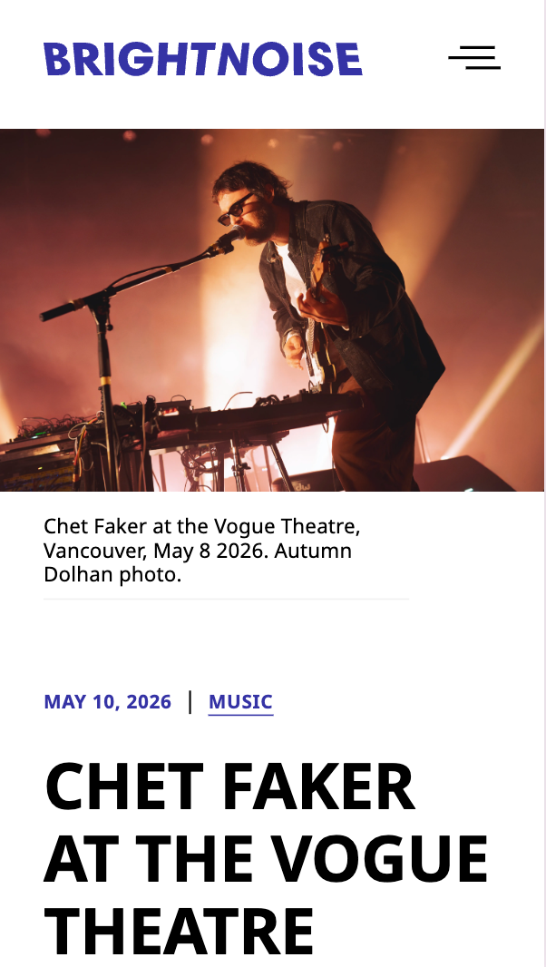
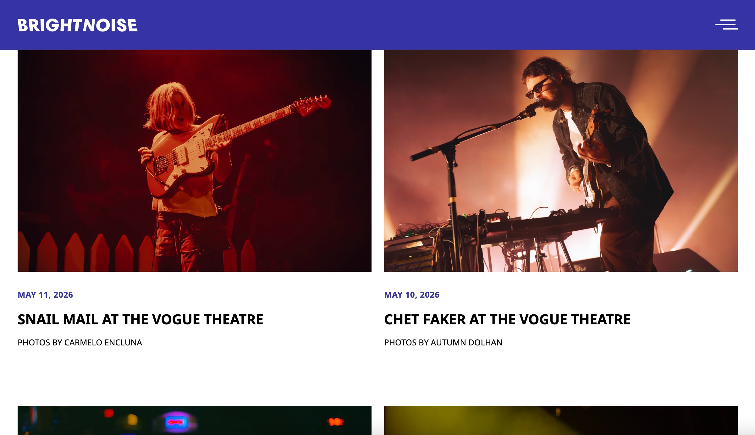
The latest posts are displayed in a 2x2 grid on the homepage.
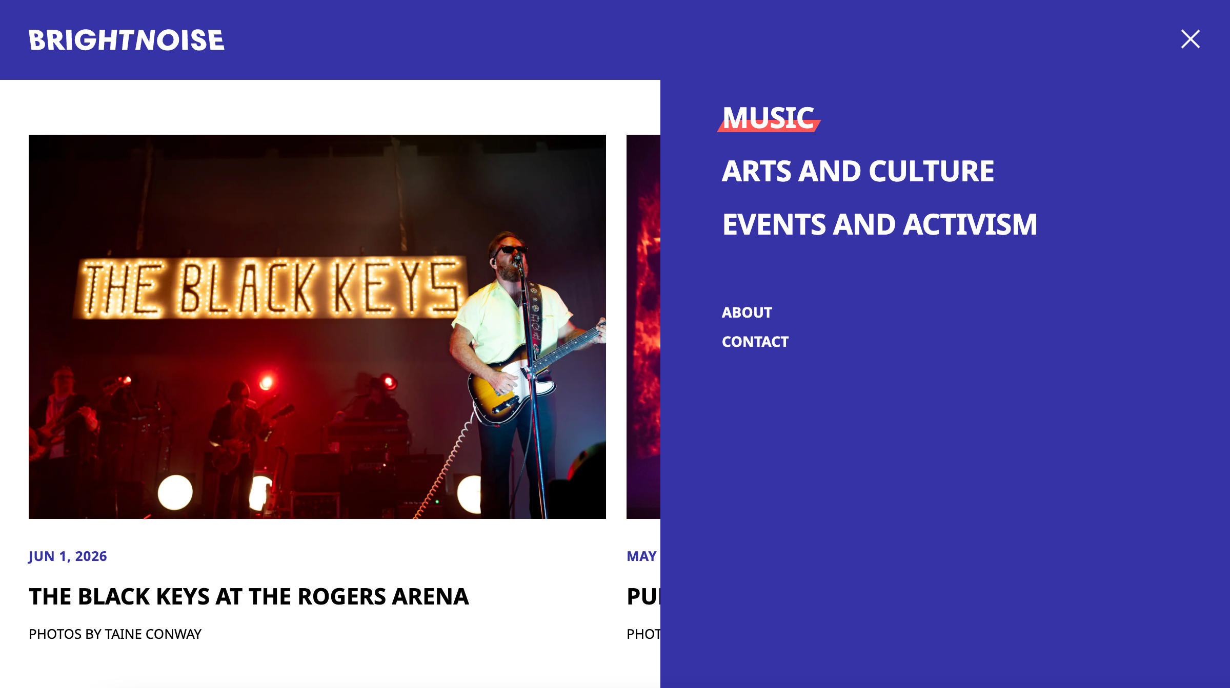
The hover effect on navigation links gives the impression of a stage under the letters.